Designed as a part of Google's UX Design certificate
Project overview
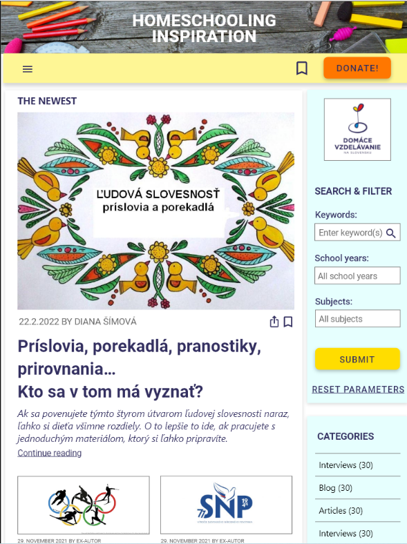
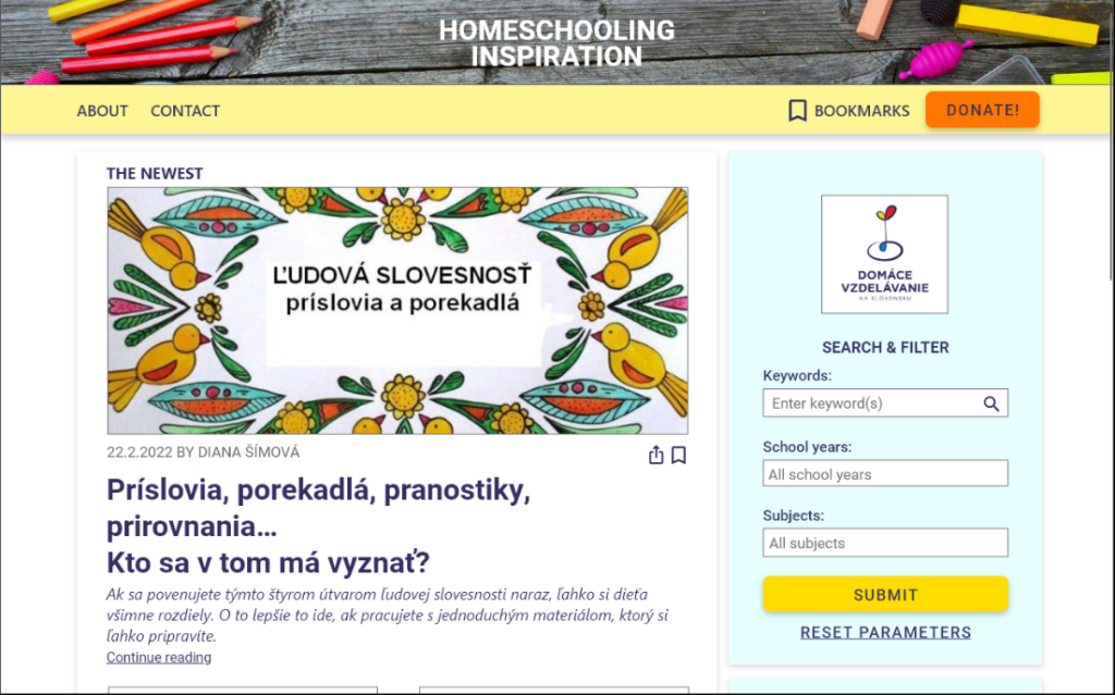
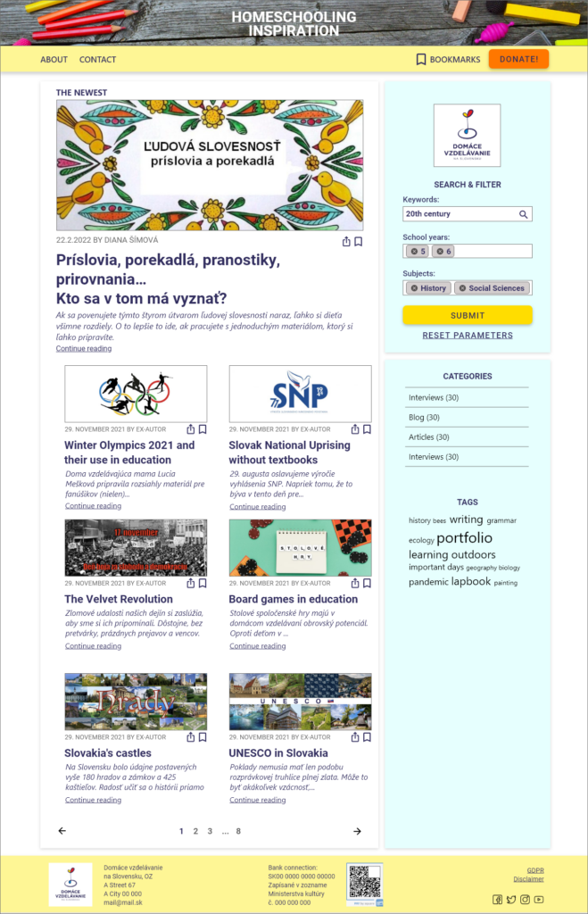
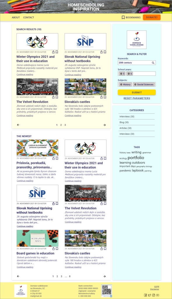
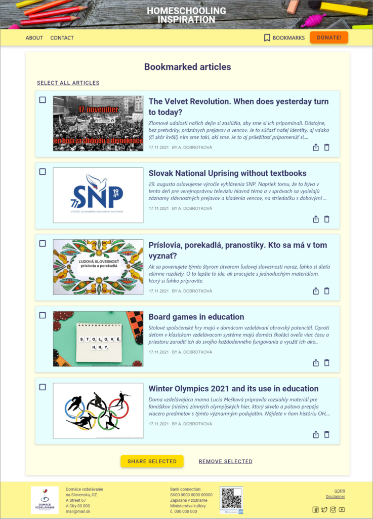
The product
Inspiration for homeschooling parents – app and responsive website.
Project duration
March 2022 – April 2022
The problem
The part Inspiration (Inšpirácia) for homeschooling parents of the web Homeschooling Slovakia
(Non Profit Organization) does not offer any searching possibilities. Therefore the resources are poorly organized and very hard to find for parents.
The goal
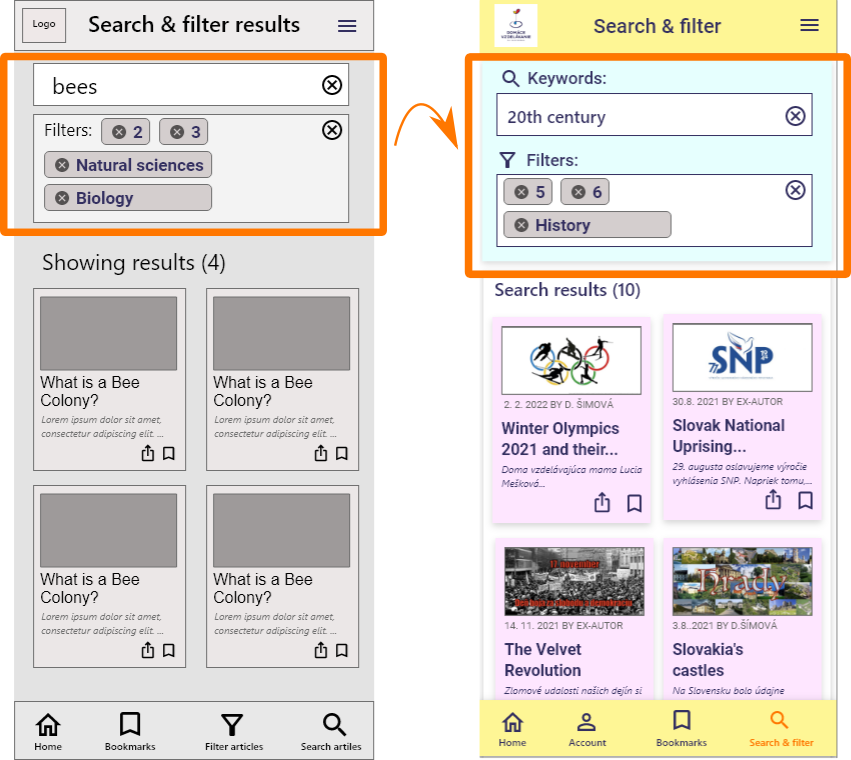
Design a search page for parents to find homeschooling resources from the web domacaskola.sk – Inspiration easily, based on several criterias.
My role
UX designer for Homeschooling Slovakia Inspiration from the beginning to delivery.
My responsibilities
Conducting interviews
paper and digital wireframing
low and high-fidelity prototyping
conducting usability studies
accounting for accessibility
iterating on designs.
Understanding the user
Summary
Conducted 4 interviews with homeschooling mothers.
Assumptions
Parents want to be able to search teaching resources by keyword, year, subject.
There is no major difference between the use of mobiles and desktop computers/notebooks.
Outcome
TRUE, but some parents wish to search also by type of document.
FALSE. Some parents use only computers for browsing. Others use smartphone to find articles and computer to read them thoroughly later.
User pain points
1
No possibility to search based on several criteria – implemented.
2
Texts on mobile screens too small – implemented.
3
Long texts, too few images – implemented.
4
Do not know what to expect on yearly exams – not possible to implement due to the organization’s restrictions.
5
People looking strangely at us because of homeschooling – Help forum – planned.
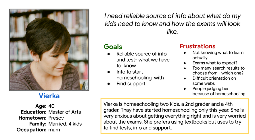
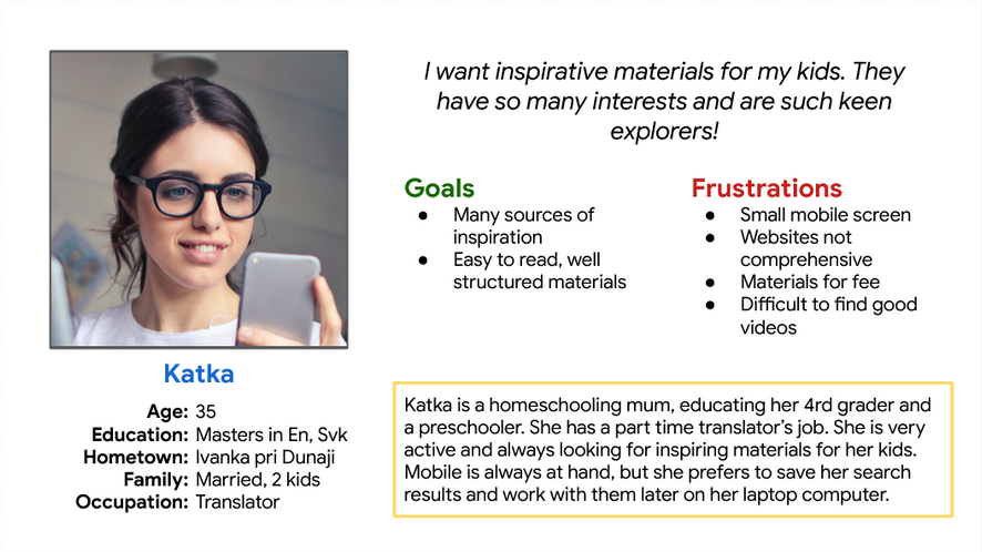
Personas & user statements
Vierka is a homeschooling mum using textbooks, who needs reliable lists of educational topics and tests for each particular school year and subject, because she wants to be sure, they are covering all the relevant topics and are well prepared for exams.
Katka is a homeschooling mum not using textbooks, who needs an effective way of finding educational materials, because she needs to make sure her kids have a wide range of materials to choose from.
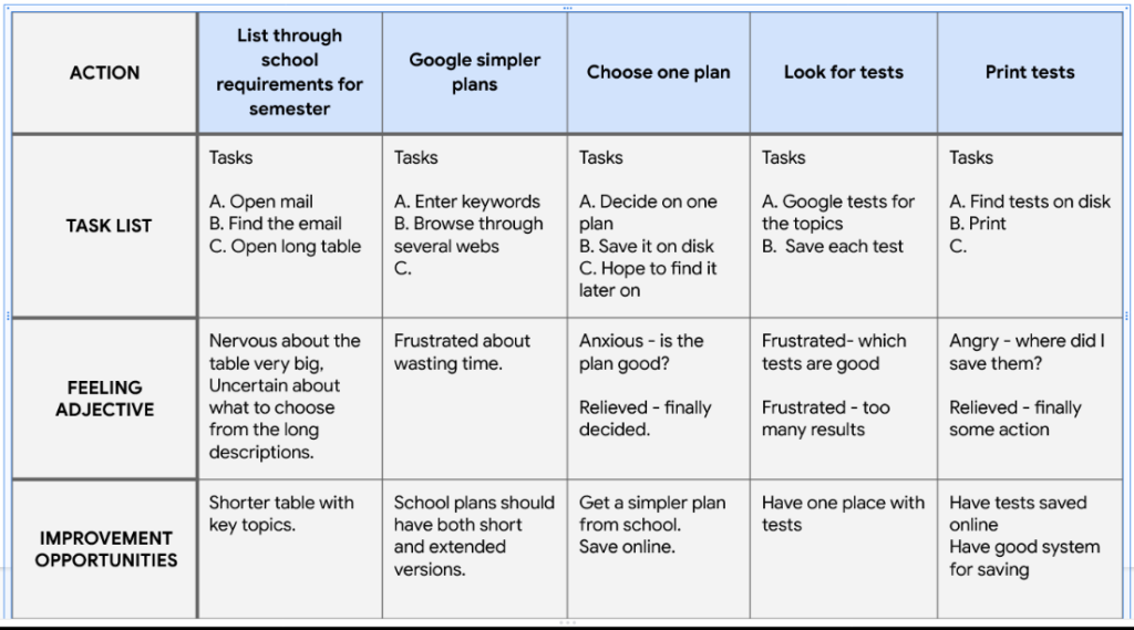
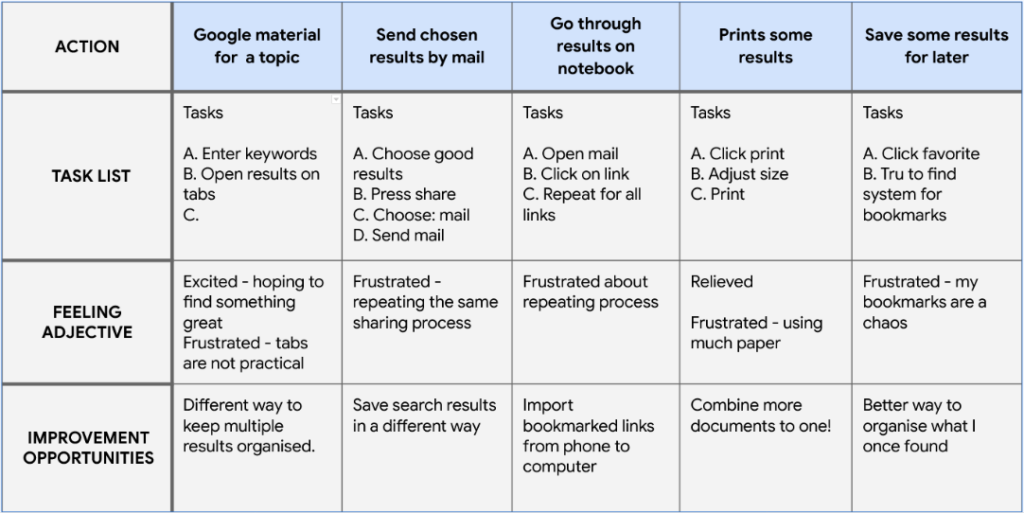
User journey map
Vierka. Goal: Decide on school requirements this semester
Katka. Goal: Find inspiration and materials for a topic
Starting the design
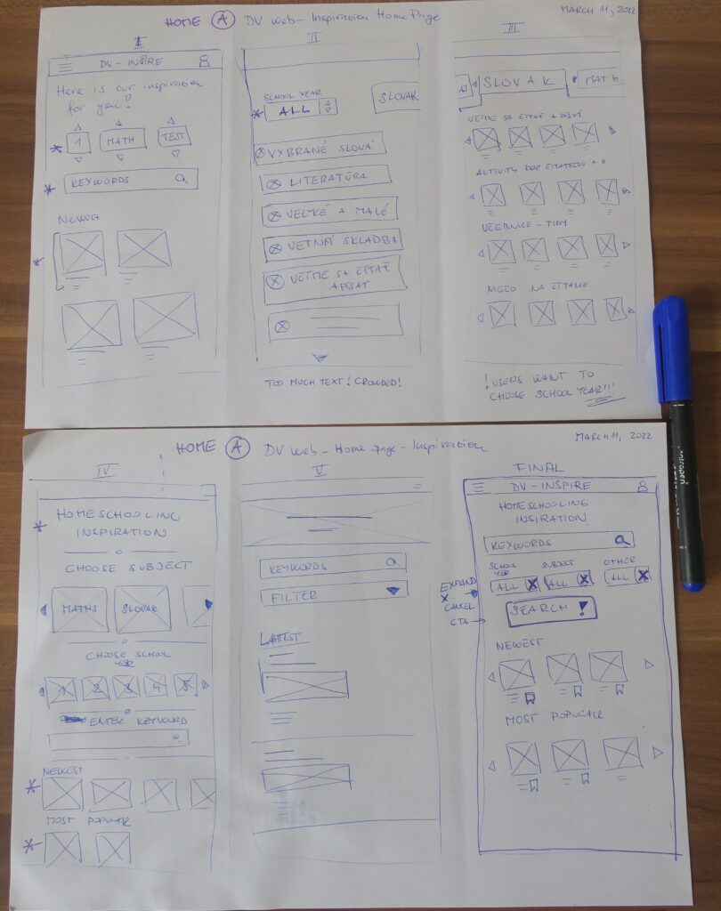
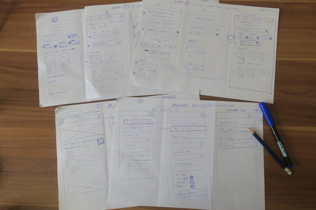
Paper wireframes
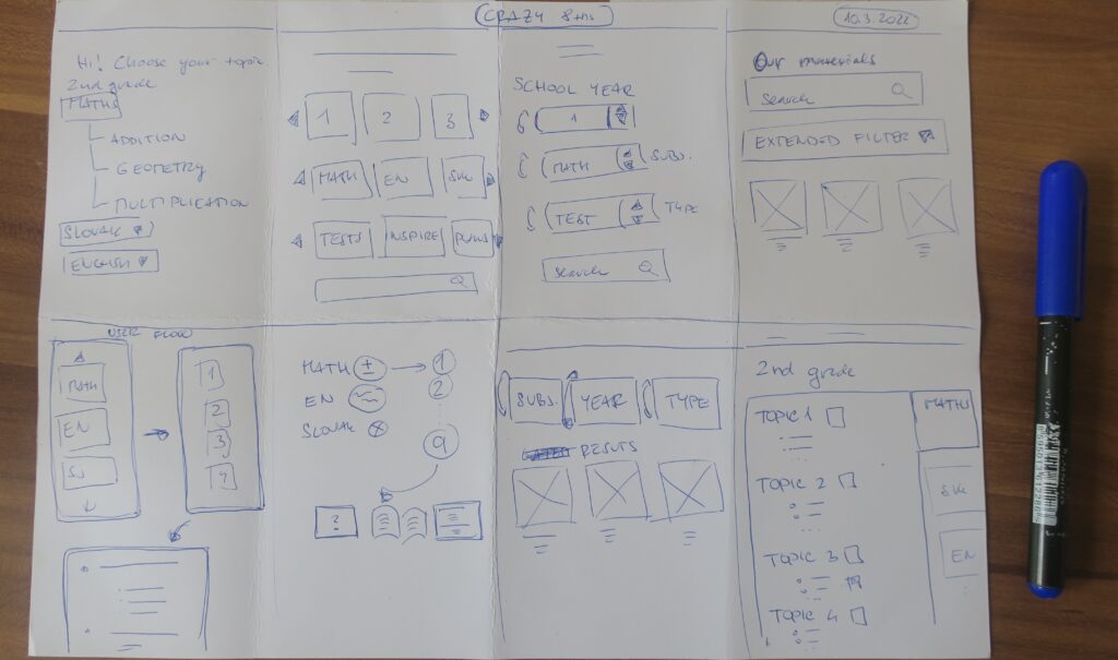
Crazy eights
More sketches
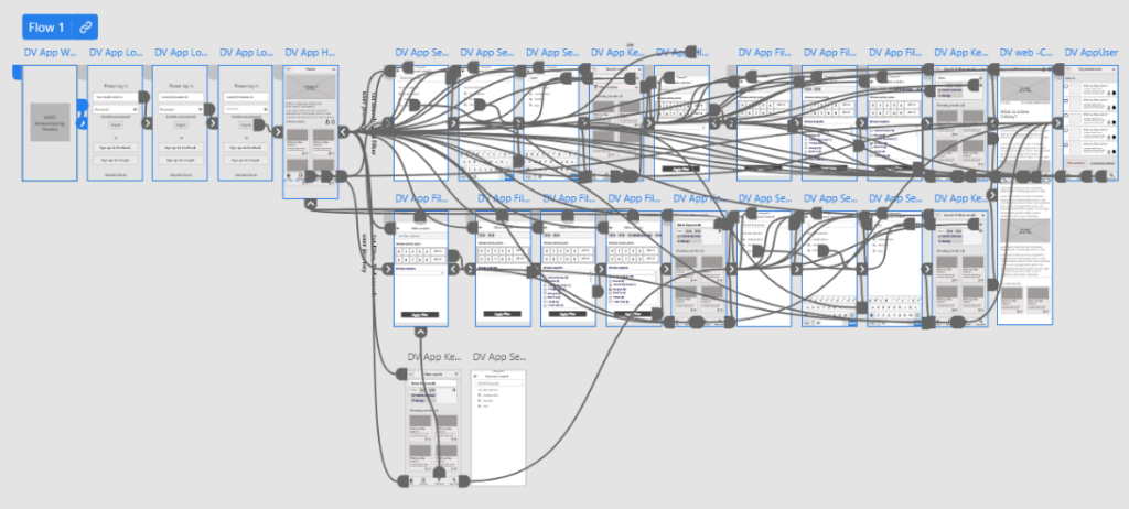
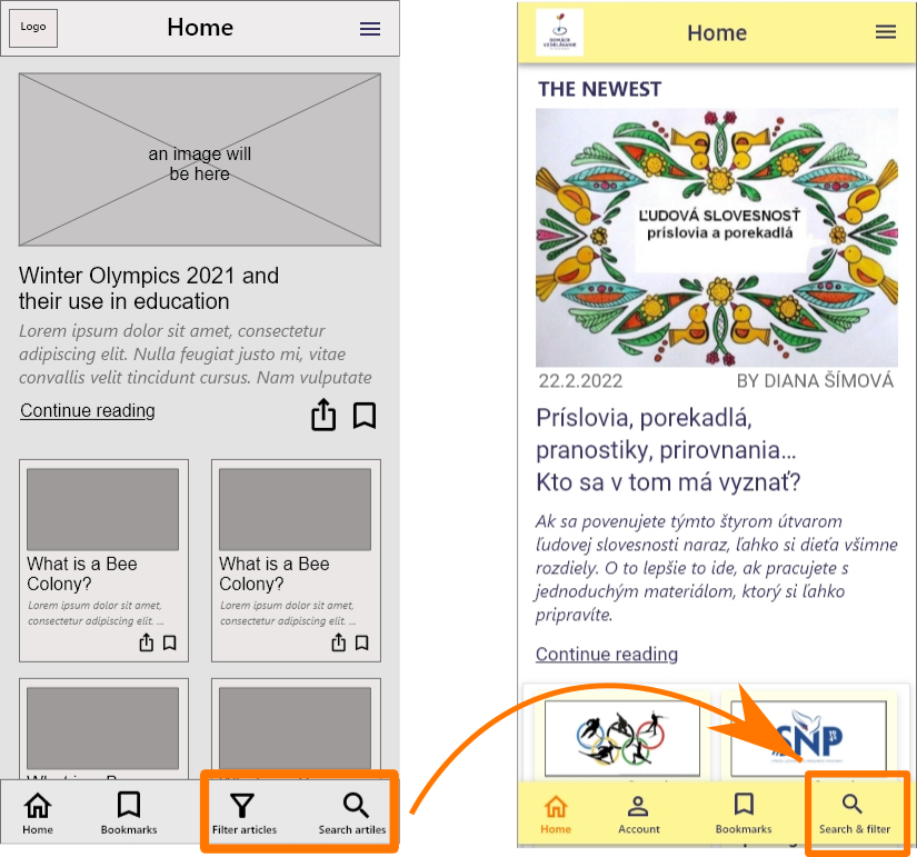
Digital wireframes - dedicated mobile app (adobe xd)