Designed as a part of Google's UX Design certificate
Project overview
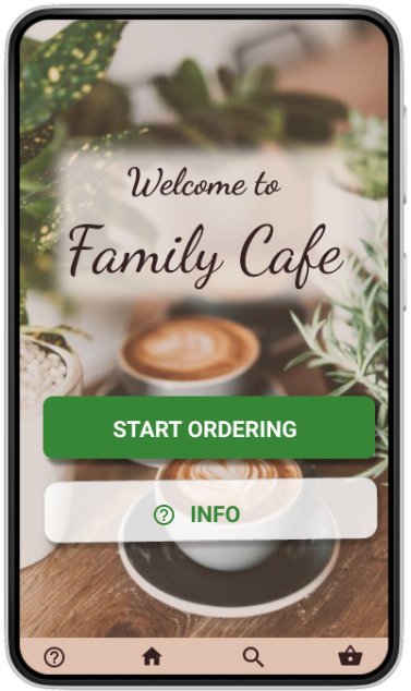
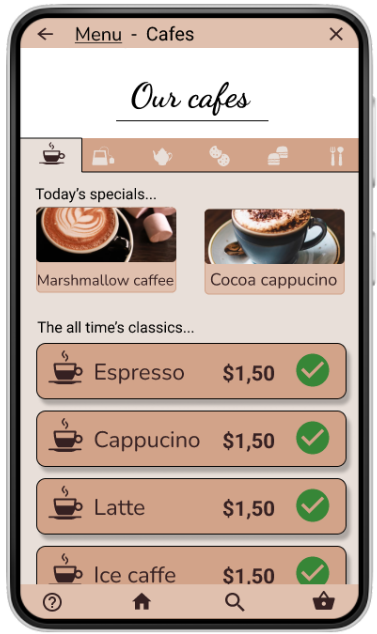
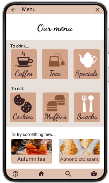
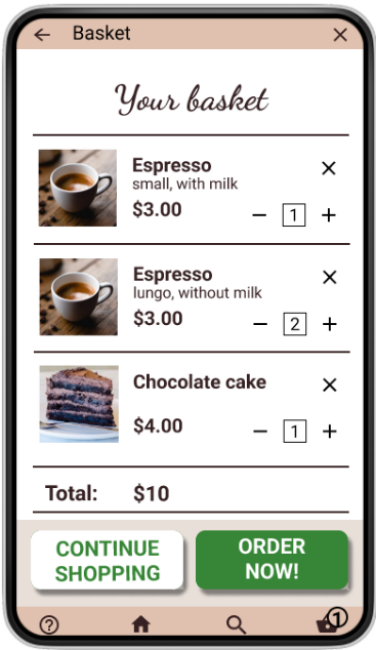
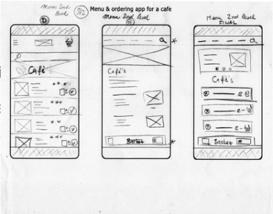
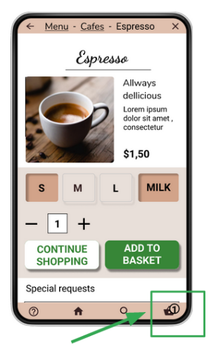
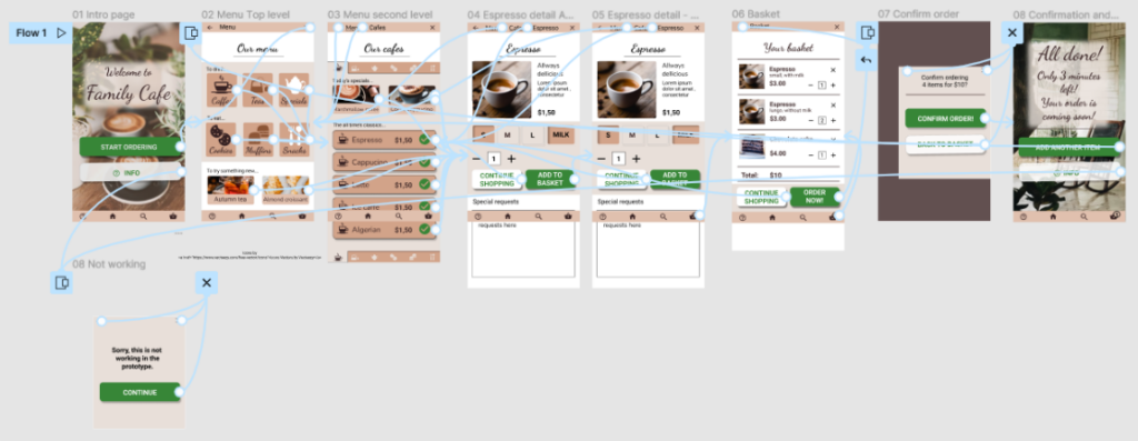
The product
easy to use
visually appealing
saves customer’s time
inspires to try new drinks and snacks
Project duration
August 2021 – January 2022
The problem
Customers in cafes often face the problem of having to wait a long time for a waiter to come.
The goal
To design an app for a fictional cafe, which would be very easy to use and be visually appealing.
My role
UX designer for Menu & ordering app from the beginning to delivery.
Responsibilities
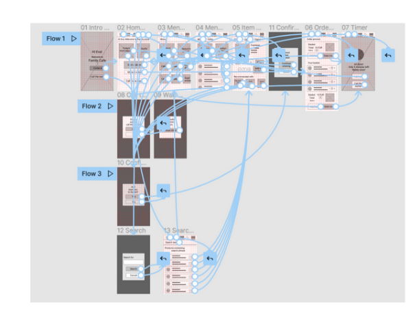
Conducting interviews, paper and digital wireframing, low and high-fidelity prototyping, conducting usability studies, accounting for accessibility, and iterating on designs.
Understanding the user
Summary
Interviews: 4
Primary user group: adults who go to cafes to enjoy their time and meet with friends.
Outcome: Benefits of such app would for the user to
be able to study the menu before it is brought to the table
be able to order if the waiters are busy
offer more attractive and diverse images of foods and drinks
Pain points
1
No menu on the table before the waitress comes and then ordering under stress.
2
Personnel not noticing me or my friends.
3
Making mistakes in my order
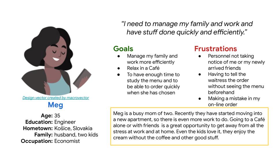
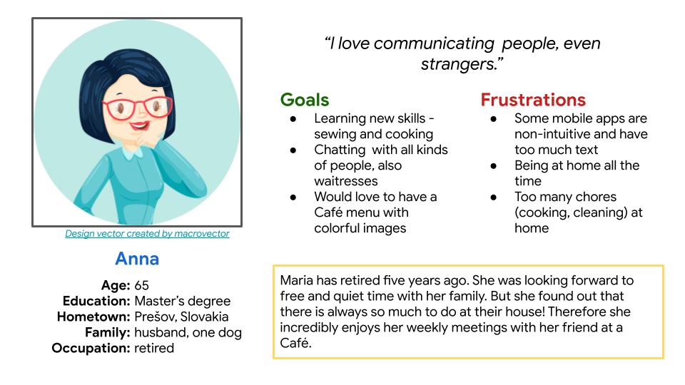
Meet our personas
Understanding the competition
Competitive audit
Competitive audit revealed that such apps are not use in our geographical region. Therefore it might be useful to introduce them. Especially with respect to the Covid-19 pandemic.