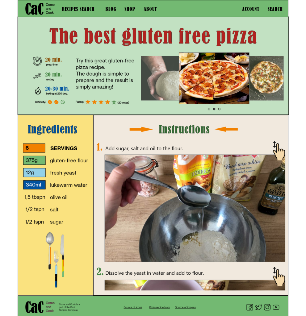
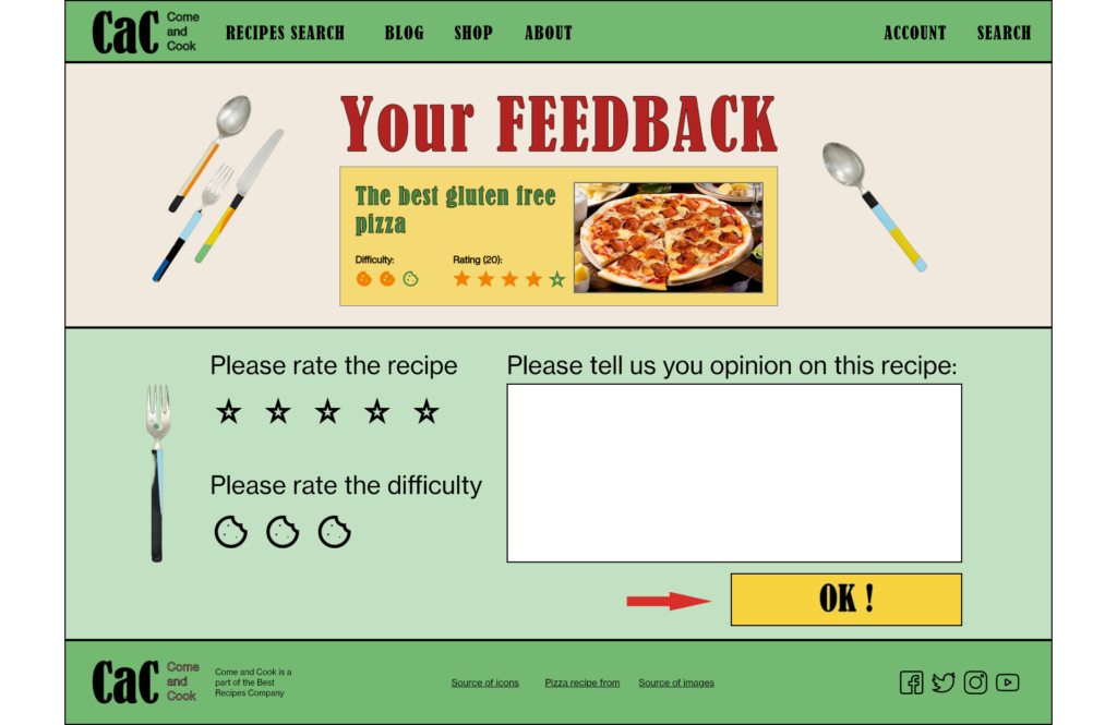
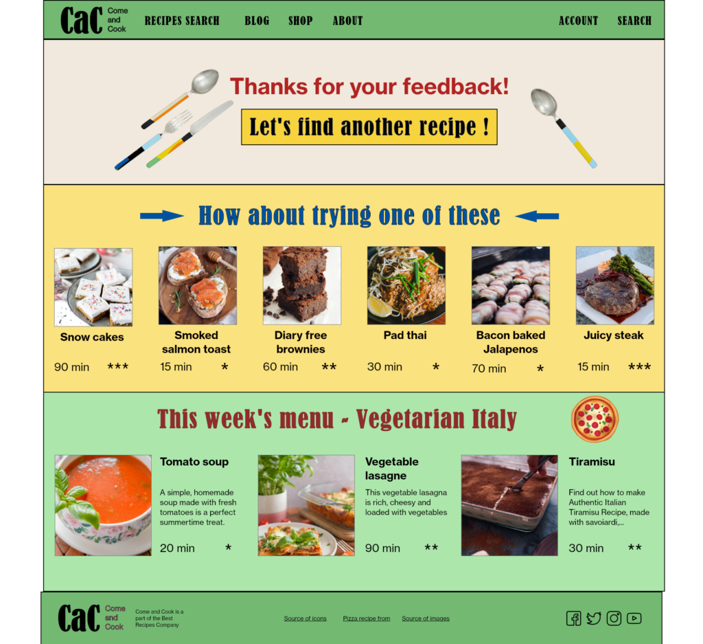
Responsive Cooking Instructions Website
Designed as a part of Google's UX Design certificate
Project overview
The product
Project duration
The problem
The goal
My role
My responsibilities
- Conducting interviews
- paper and digital wireframing
- low and high-fidelity prototyping
- conducting usability studies
- accounting for accessibility
- iterating on designs
- responsive design
Understanding the user
Summary
I conducted four user interviews, which I then turned into empathy maps to better understand the target user and their needs.
Outcome
First group of users
an efficient way to find
reliable cooking instructions with
ingredients they have at home on
appropriate skill level because they want to
cook quickly.
I concentrated on this group.
Second group of users
Wants
a feed of
high quality recipe instructions,
because they want to
get perfect in cooking.
This was a suprise result.
User pain points
1. Long intros
2. Bad recipes
3. Searching problems
4. Accessibility
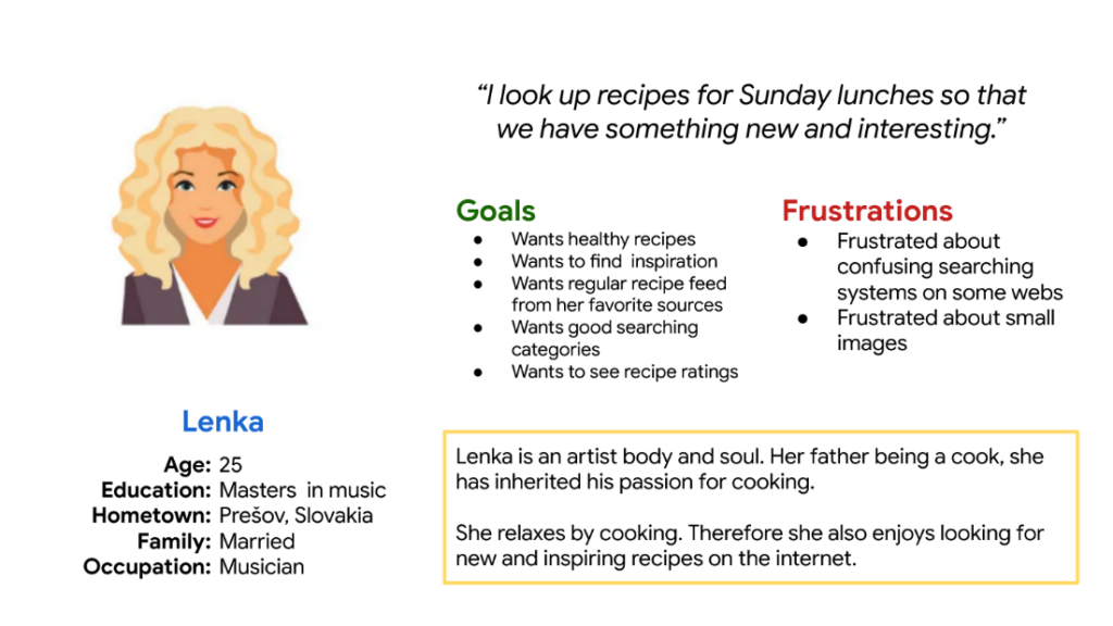
Personas & user statements
First group of users
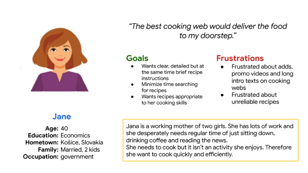
Second group of users
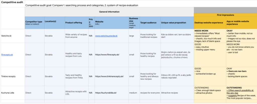
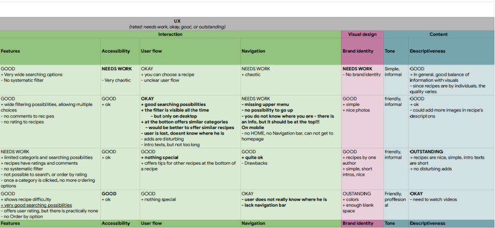
Competitive audit
Competitive audit revealed the following opportunity – create a webpage with recipes that:
- encourages users to rate recipes
- has systematic and clear searching options (e.g. like nay.sk) offering multiple parameters
- has open, clean design with sufficient blank spaces
Starting the design
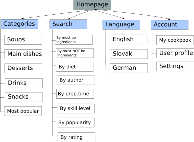
Sitemap
Ideation
Crazy eights
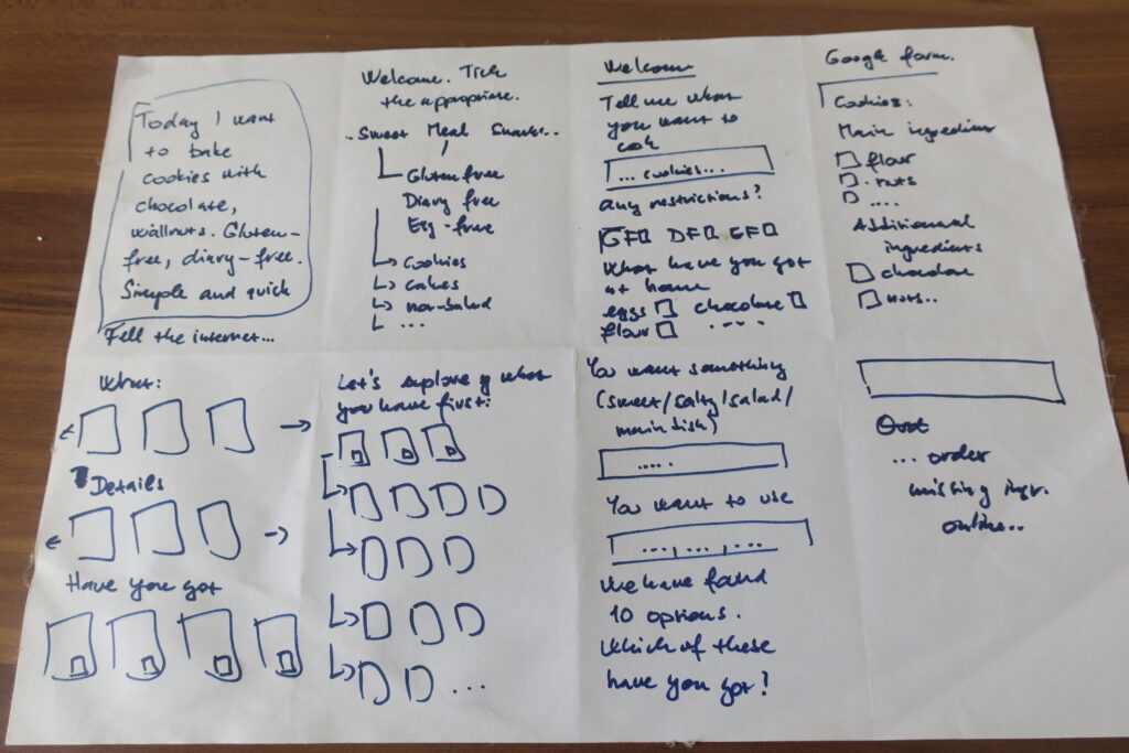
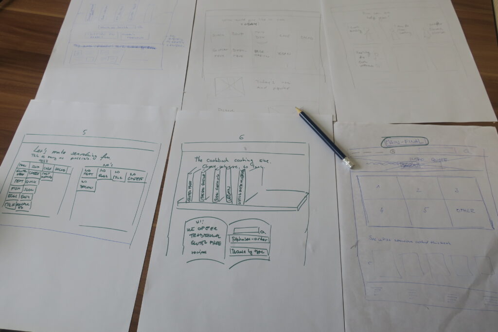
Sketches - Paper Wireframes
How Might We...
Amplify the good: How might we help Jane be more spontaneous and improvise?
Remove the bad: How might we remove all the bad recipes from the internet?
Explore the opposite: How might we turn a recipe on inappropriate skill level, with impossible ingredients into the most exciting cooking experience ever?
Question an assumption: How might we help Jane not cook at all?
Go after adjectives:
- How might we turn strange ingredients into funny ingredients?
- How might we turn a too simple recipe into a challenging recipe?
- How might we turn terrible result into fantastic result?
Identify unexpected resources: How might we use the time browsing on the web for something different, e.g. asking a friend for a recipe?
How might we borrow missing ingredients from neighbors?
Create an analogy from need or context: How might we make searching the web for a recipe like solving a puzzle?
Play POV against the challenge: How might we make the recipe searching experience like something Jane is looking forward to?
Change the status quo:
- How might we make Jane’s husband look up the recipe and cook?
- How might we make looking for recipes real fun?
Break POV into pieces:
- How might we filter out unreliable recipes?
- How might we only offer recipes with ingredients Jane has at home?
- How can we offer only recipes on an appropriate skill level?
- How might we give Jane more time?
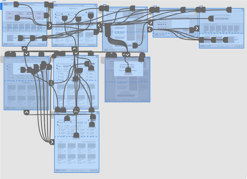
Digital wireframes
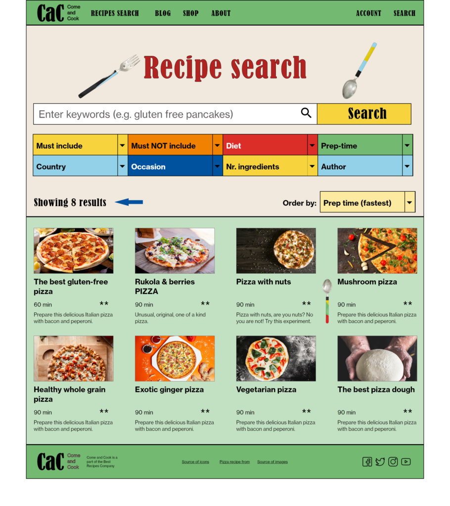
- filtering
- searching
- ordering
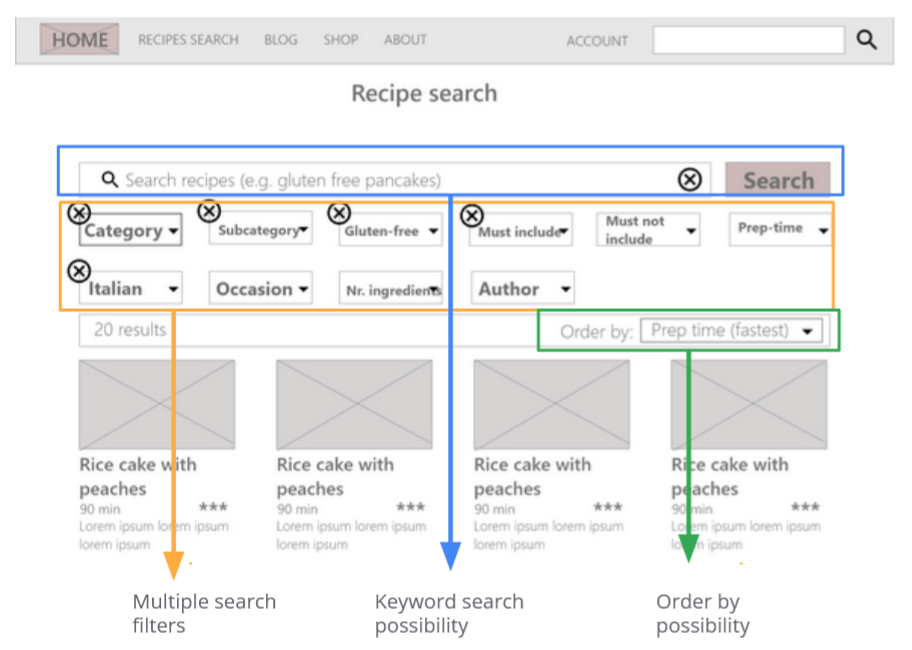
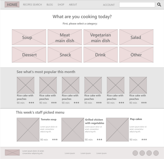
Screen variations - Responsive Design
Desktop, 1920 x 1280 px
iPad, Nexus 9 – 1

iPhone 6, 7, 8, SE – 1

Usability study - Parameters & Findings
- un-moderated usability study
- 5 participants
- Slovkia (remote)
- 5 mins duration
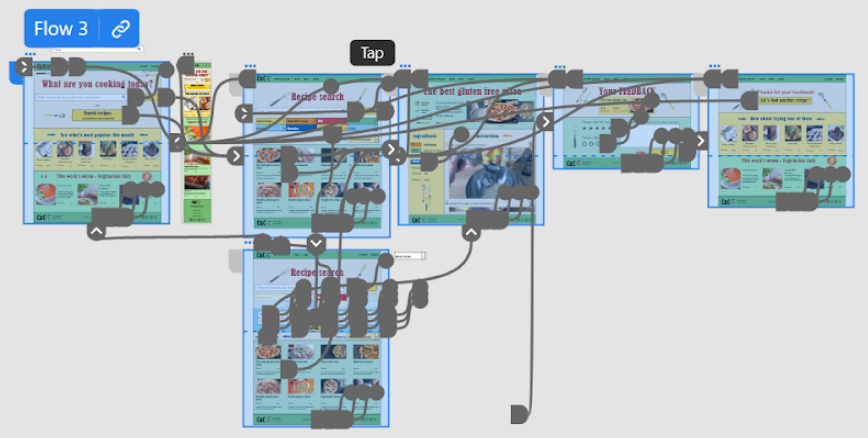
1. Prototype
All users were frustrated about the elements being static, i.e. not being able to select or change anything.
2. Search flow
3. Keywords
Refining the design


Accessibility considerations
1.
2.
3
Going forward
Impact
What I learned
1.
2.
3.
Add features for the second group of users, who want to get better in cooking.
