Making Kalvarka.sk responsive

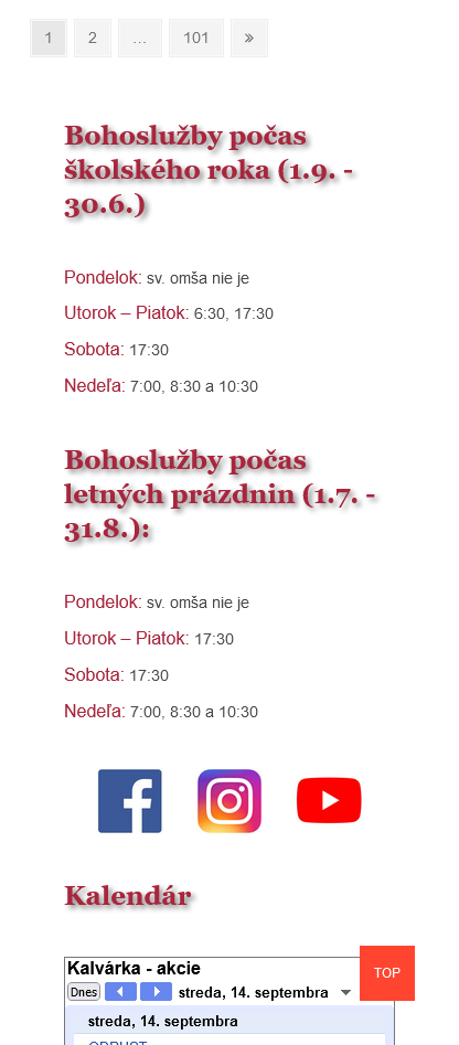
So this is certainly not desirable responsive behavior on mobiles: The top gap is too large. And the text around contacts and QR codes is our of order. On desktop all seems to be quite fine (although not perfect, since…
Frontend development & Web design
Frontend development & Web design

So this is certainly not desirable responsive behavior on mobiles: The top gap is too large. And the text around contacts and QR codes is our of order. On desktop all seems to be quite fine (although not perfect, since…