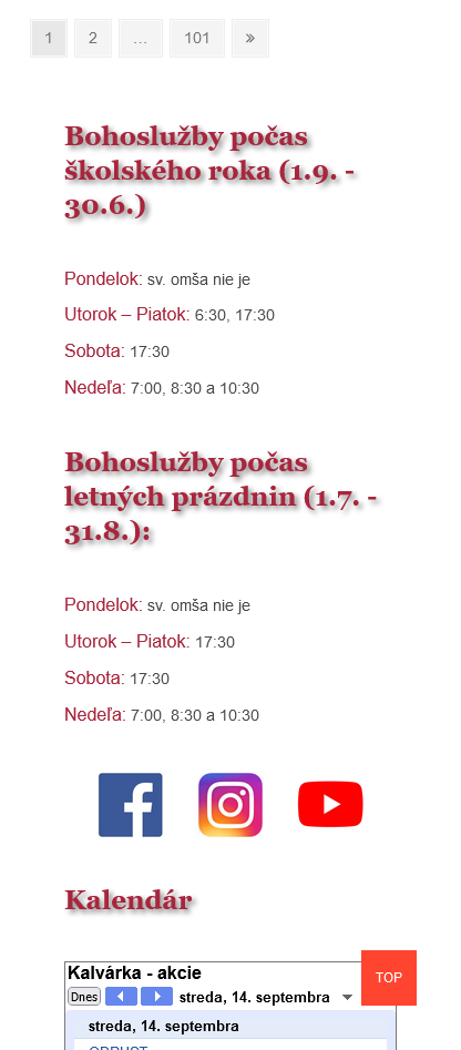
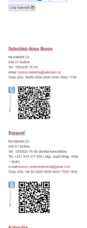
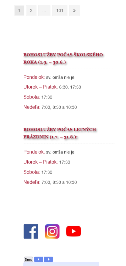
So this is certainly not desirable responsive behavior on mobiles:
The top gap is too large. And the text around contacts and QR codes is our of order.
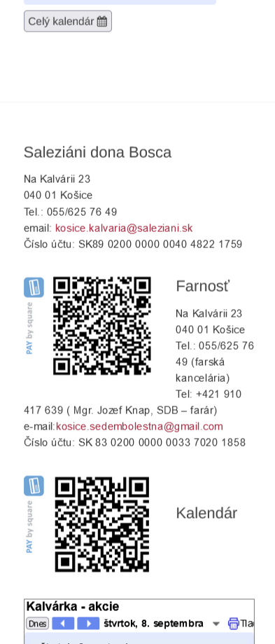
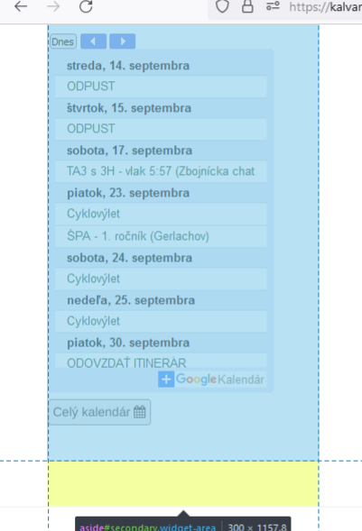
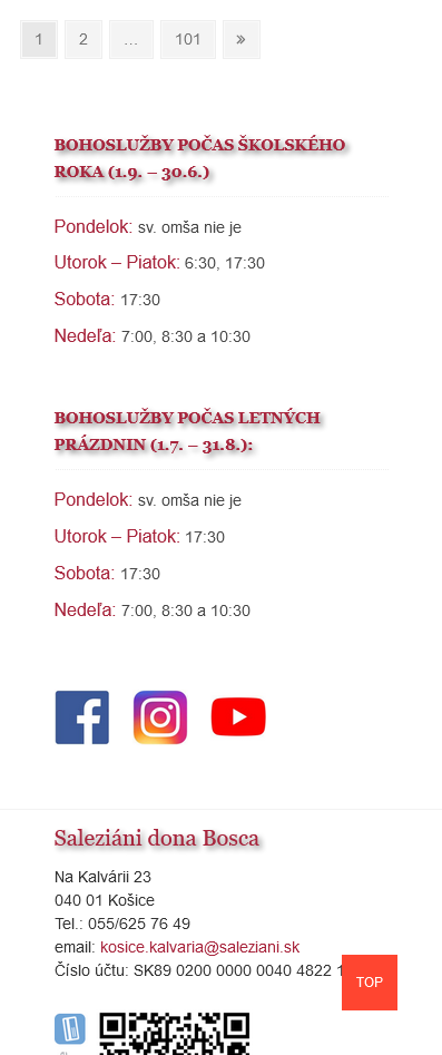
On desktop all seems to be quite fine (although not perfect, since the QR codes are not in one line):
Work to be done
1. Find out how the footer is set up
I have found out, that instead of inserting the QR code as image blocks, they are inserted via html, without any formatting telling WP about their positions.
<a href="http://kalvarka.sk/wp-content/uploads/2022/07/QR_SK8902000000004048221759-300x256.png"><img class="alignleft wp-image-8871 " src="http://kalvarka.sk/wp-content/uploads/2022/07/QR_SK8902000000004048221759-300x256.png" alt="" width="178" height="152" /></a>
2. Edit the way in which images are inserted in the footer
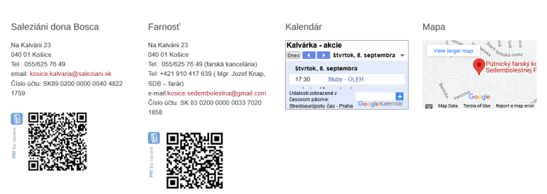
So, the first step is simple – insert the QR code images via image blocks. I have set their size to 25%. The result is much better.
3. Remove the gap in the footer
There is still a huge gap though. Let us inspect why it is there. We shall use the Firefox code inspector. (All web browser have almost identical inspectors).
So this is what we see in the code inspector:
Yellow color represents the margin of an element. We can also see it in the Box model:
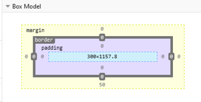
The bottom margin of the selected element is 50px. The code inspector allows us to try it changes to see how they would look. In the tab “This Element” we can type in new properties, in our case:
margin-bottom:0px;
And voila, the gap gets smaller. Not small enough however. Upon inspection we find out that one of the bottom containers has the padding-top set to 50px (the color for padding is purple). so we set padding-top:0; for this container.
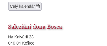
The results looks good.
However these ore only temporary changes. To have them permanently, we choose the tab Changes in the code inspector. And click Copy All Changes. The changes with the appropriate elements are now in the clipboard. We have put them into action in our WP site. For this end I like to use the SiteOrigin CSS plugin. So let us paste the changes using this plugin.
#secondary {
  margin-bottom: 0;
}

div.widget-area {
  padding-top: 0;
}
Let us save changes and we are…not finished. Our rule is overriden by the rule:
#colophon .widget-area {
	padding: 50px 0 10px;
}
So instead of the div.widget-area selector, we use #colophon .widget-area selector and now it works. Like this:
#colophon .widget-area {
	padding-top: 0;
}
On checking the page on normal display we see that some space above the bottom widget would look good, so we change our rule to:
#colophon .widget-area {
	padding-top: 10px;
}
4. Remove other gaps
Upon inspection we find some empty elements int he widget area which create some extra space. We remove them and in the similar manner as in the previous chapter we also remove other gaps on the widget part of page.
5. Social media icons
The social media icons are inserted via html as images with links:
<a href="https://www.facebook.com/kalvarka"><img class="alignleft wp-image-8492" src="http://kalvarka.sk/wp-content/uploads/2021/04/fb-e1617802958883.jpg" alt="" width="50" height="50" /></a>
<a href="https://www.instagram.com/kalvaria_saleziani/?hl=sk"><img class="alignleft wp-image-8493" src="http://kalvarka.sk/wp-content/uploads/2021/04/instagram.jpg" alt="" width="50" height="50" /></a>
<a href="https://www.youtube.com/channel/UCDntdIEYeHSw98Jp0nzIReg"><img class="wp-image-8494 alignleft" src="http://kalvarka.sk/wp-content/uploads/2021/04/youtube-e1617803118875.jpg" alt="" width="50" height="50" /></a>
Let us leave that but add some responsive formatting. Let us clothe the images in a flexbox. Here is a very nice listing of flexbox possibilities. With the following styling and size adjustments the icons look good.
<div style="display:flex;  justify-content:space-evenly;">
   <div><a href="https://www.facebook.com/kalvarka"><img src="http://kalvarka.sk/wp-content/uploads/2021/04/fb-e1617802958883.jpg" style="width:60px; height:auto;"/></a>
   </div>
<div>
<a href="https://www.instagram.com/kalvaria_saleziani/?hl=sk"><img  src="http://kalvarka.sk/wp-content/uploads/2021/04/instagram.jpg" style="width:60px; height:auto;" /></a>
</div>
<div>
<a href="https://www.youtube.com/channel/UCDntdIEYeHSw98Jp0nzIReg"><img  src="http://kalvarka.sk/wp-content/uploads/2021/04/youtube-e1617803118875.jpg"style="width:60px; height:auto;" /></a>
</div>
And that’s it for now. See for yourself kalvarka.sk
