I have been working on the web of my husband, who is a translator. Since it is my husband, the priority of this work is unfortunately very low…But now the time has come to improve the design.
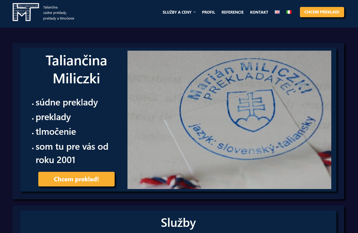
This is the version from 2022:
Now I had one friend tell her opinion. She did not like
- the shadows under letters
- large cookie consent banner
My husband
- wanted a dark background and
- did not like the image.
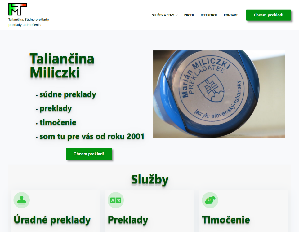
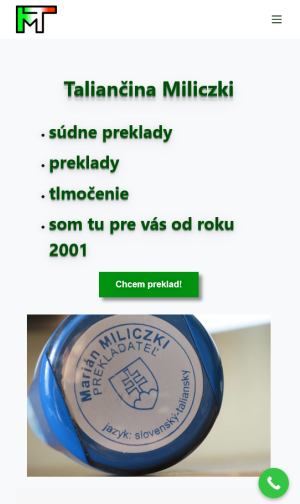
So this is our new version with
- dark background
- professional free image
- simple letters
- smaller cookie consent bar
The site needs some font color customization. But there is one bigger problem. It is made using Elementor. This is a great environment for beginners since it offers lots of customization options. However, if you want to add custom css, there are problem. Each element is encapsulated in many other elements and things get messy. For example the top container:
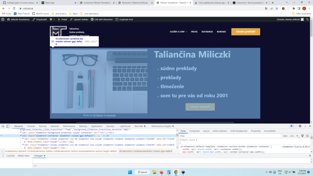
section.elementor-top-section:nth-child(1) > div:nth-child(2)
The title Taliancina Miliczki:
.elementor-element-6bf8d91 > div:nth-child(1) > h1:nth-child(1)
The page also has to be translated and we need all the blocks to be the same. It is much simpler to make the page in Gutenberg editor and assign custom classes to containers.
I used the BEM notation for css. Here is an excerpt from my custom css:
.block{
    border-radius: 5px 5px 5px 5px;
    box-shadow: 5px 5px 5px rgba(0, 0, 0, 0.9);
}

/* vonkajsi blok ma farbu a padding */
.block--outer{
    background-color: var(--theme-palette-color-7);
    padding: 20px 30px 30px 30px; /* musim prebit vyber id ckom */
}

.block--inner{
    background-color: var(--theme-palette-color-6);
    margin-top: 0;
    padding: 10px 20px;
    /* nech sa roztiahne na svoje maximum, kvoli mobilu */
    height: 100%;
}

div.block__content{
    row-gap:0;
}
See the result on miliczki.sk