
So the webpage I have became admin of has these plain buttons. The color is taken from the logo, but the button itself gets sort of lost. So…
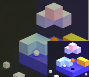
Let’s make the button 3D
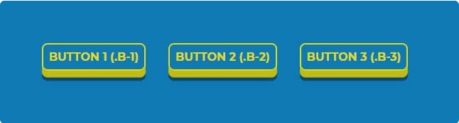
This is from dev.to – Simple 3D CSS Buttons, by Igor Zanella. I only needed to use different colors.
1. Colors and border
First I have defined colors, they are taken from the logo:

  :root{
            --red: #a8263d;
            --white: #ffffff;
            --orange: #f1aa5a;
        }
Next come the basic properties, without 3D effect.
.slider-content .btn-default {
		color: #ffffff;
		background-color: var(--red);
		font-family: Georgia, serif;
		font-weight: 600;
		letter-spacing: 2px;
		text-transform: uppercase;
		text-decoration: none;
		margin: 1rem;
		padding: 0.8rem 2rem 0.8rem 2rem;
		border: 2px solid var(--white);
		border-radius: 0.5rem;
}

.slider-content .btn-default:hover {
  background: var(--orange);
  color: var(--red);
  border-color: var(--red);
}
Our buttons now look like this, normal and hover state.

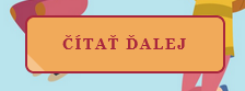
Next I decided to change the white to light orange --light-orange: #F7CA97;
2. 3D Effect
We add two shadows here. One for the 3D effect – by adding a solid shadow of slightly darker color than the border. Slightly darker in this case means plus 14 in the KEY in the CMYK (cyan, magenta, yellow, and key) color model.
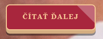
The code is this for normal state:
box-shadow: 0 0.6em #d4ad81, 0 0.9em rgba(0, 0, 0, 0.4);
3. Transition
Out of three possibilities listed in the article I have chosen the first one. On hover, the button lowers 0.2em and on click, i.e. active, it lowers even more, 0.4em.
To make the the effect of “lowering”, not floating around, we have to set the button’s position to relative and we set the top to be 0 in the neutral state:
  position: relative;
  top: 0;
Next, we tell the browser that the button will change on all sides, during 400 milliseconds and the animation will be ease-in-out (slower-faster-slower).
transition: all 400ms ease-in-out;
In the :hover state we shall make the button 0.2em lower in two steps. First we move the the button 0.2em lower (top:0.2em). And second we make the solid shadow, making the 3D effect, 0.2em smaller:
top: 0.2em;
/* Normal shadow *.
/* box-shadow: 0 0.6em #851e30, 0 0.9em rgba(0, 0, 0, 0.4);*/
/* Lowered shadow */
box-shadow: 0 0.4em #851e30, 0 0.7em rgba(0, 0, 0, 0.4);
In the :active state the button goes even lower:
.slider-content .btn-default:active {
    top: 0.4em;
    box-shadow: 0 0.2em #851e30, 0 0.5em rgba(0, 0, 0, 0.4);
}
And that’s it. Visit kalvarka.sk
